A Close Read of a Tag Group
March 2022
·
5 min read
An illustrative example
This article takes an overly simple example, and uses it to expose a number of challenges and questions that you are likely to encounter with tags and taxonomies in your own work. We take this opportunity to showcase a variety of tricks that you might want to adapt to your own context and content, building on some of the approaches we previously discussed.
Colors
If you were to imagine a tag group of colors, you would probably think of something like this:

We might have a discussion about whether Indigo should be added to the list or whether it’s a type of blue; and you might prefer to use violet over purple. But conceptually, it would still be a simple list of the colors we intend to tag highlights with.
And that works fine!
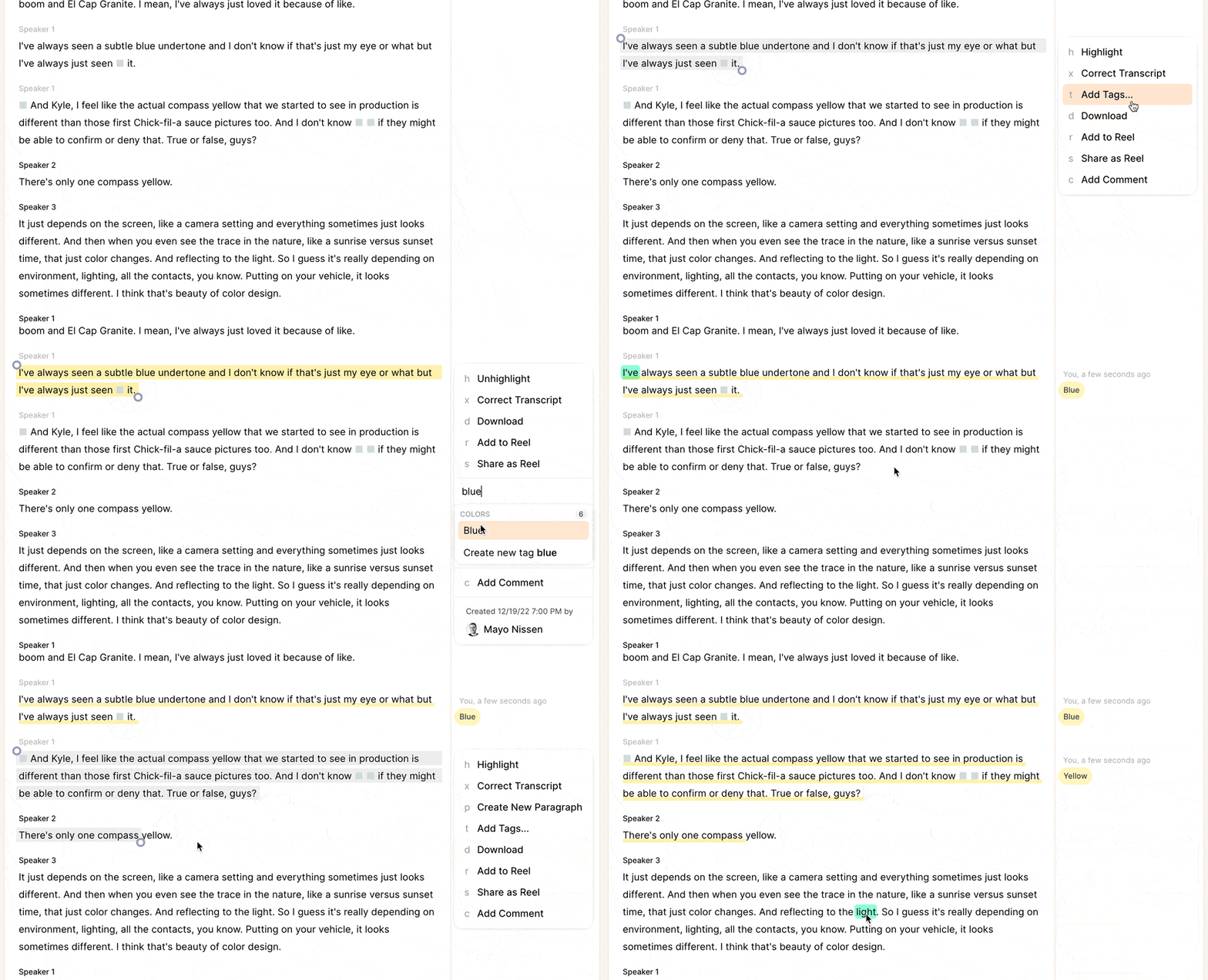
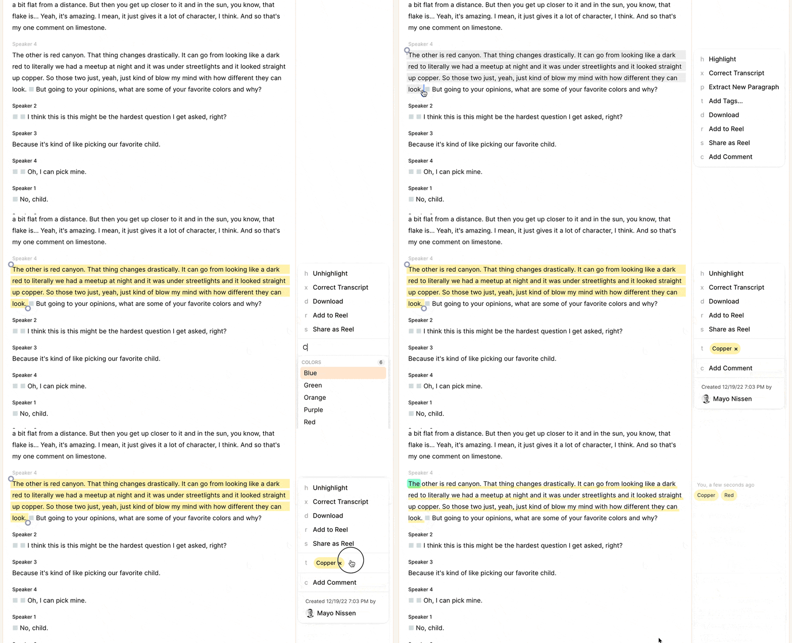
Now, let’s imagine you are reviewing a recording, and you associate something you encounter with the color violet, but the word "purple" slips your mind - suddenly you might find yourself struggling to quickly find the intended “correct” tag, and lose your sense of flow.
Next, you encounter something describing a shade of copper - do you tag it with the existing shade of red? Or is it really a shade of brown? Should you tag it with both? Or do you just make a new tag called copper? If you’re working by yourself, you might be able to be consistent in your answer, but as soon as you collaborate with others, you will find that their answers to the above questions differ from yours, one way or another.
A more complex setup
Now let’s look at a more complex set of tags, that’s optimized for ease of use and a specific workflow. We’ll stick with the theme of colors, as an illustrative example. There are a number of things going on here, not all of which will be relevant to all situations. But a closer read might give you some ideas that you can translate to your own work…
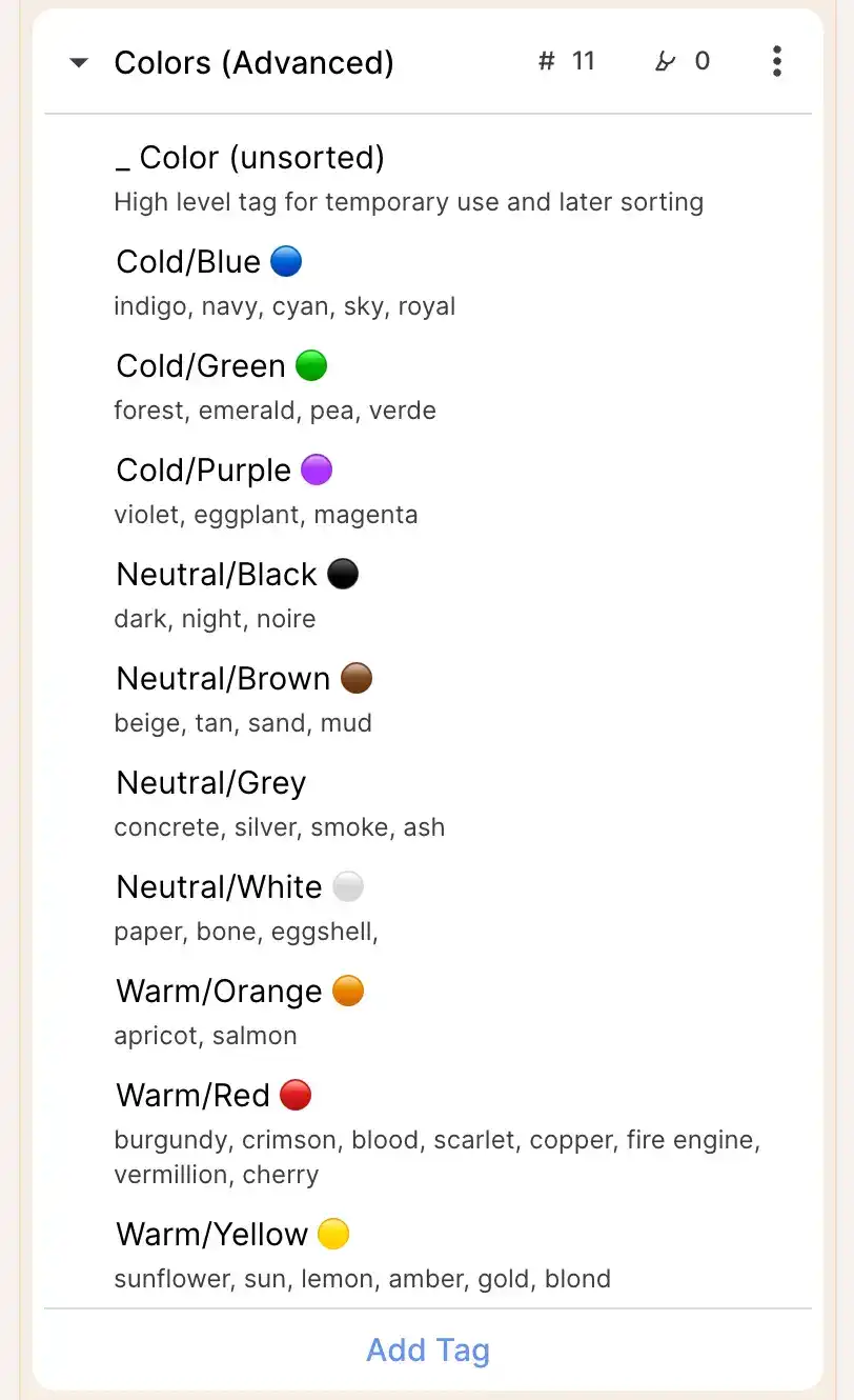
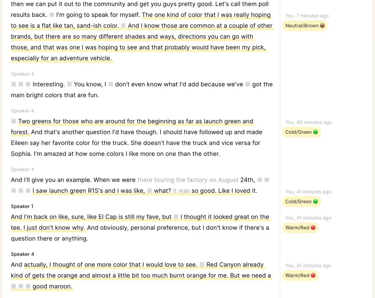
Here, the color tags use emojis in the name, which will show up in the margin wherever that tag is applied, for a quick glance.
Each color tag starts with "Cold/" , “Neutral/” , or “Warm/”. This allows you to introduce an additional layer of hierarchy, if you have notional subgroups within a group. We’ve put the emoji at the end of the name, rather than the beginning, so that the tags sort predictably when sorted alphabetically (in this case, grouped by Cold/Neutral/Warm; in other situations, such as customer journey stages, you might number the tags; in others however, the sequence is irrelevant, and you might prefer the emoji at the beginning of the tag name (for aesthetic reasons, if nothing else!). If sorting isn’t important, you could also put the “subgroup” into the description field, so it could be searched by but not show up in the margin.)
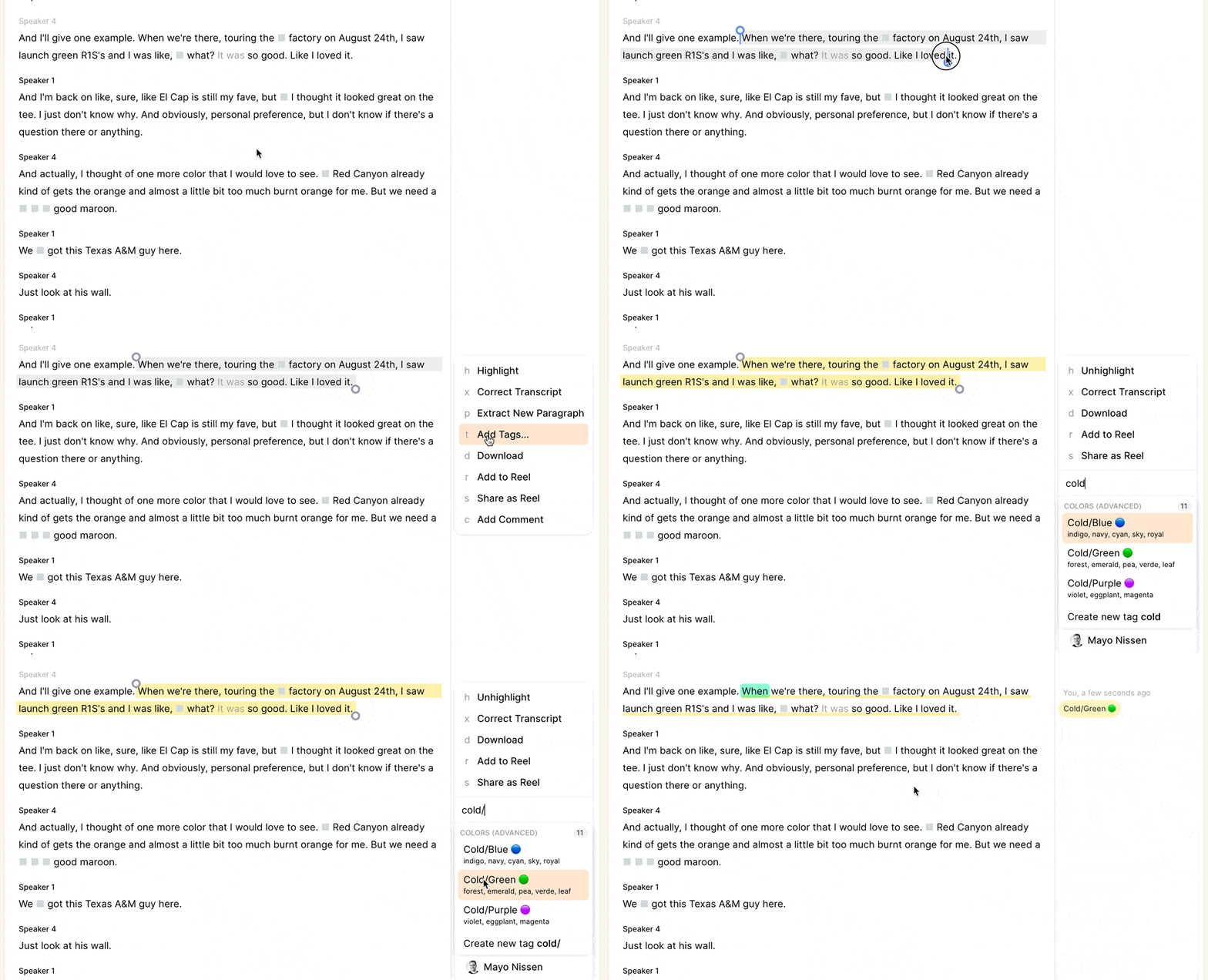
Each color also has a set of synonyms listed in the description field - these help in two ways. When applying a tag (eg, within a recording), the autocomplete will match to those alternative terms, so you don’t need to remember the exact term used to name the tag. This guides the user to use certain higher level tags over others (here: copper is a synonym of Red, but not Brown; you might choose otherwise, or include it in both and leave it to the person doing the tagging to determine which is more appropriate for the specific content they are looking at.) This has the consequence of protecting a taxonomy from fragmentation, and helping users connect the dots between related ideas rather than siloing them in too-narrow categories.
You could use the description field for translations, too, so your French-speaking colleagues can type "verde" and still have it match the tag “Green”, such that your analysis can more easily cut across material in different languages.
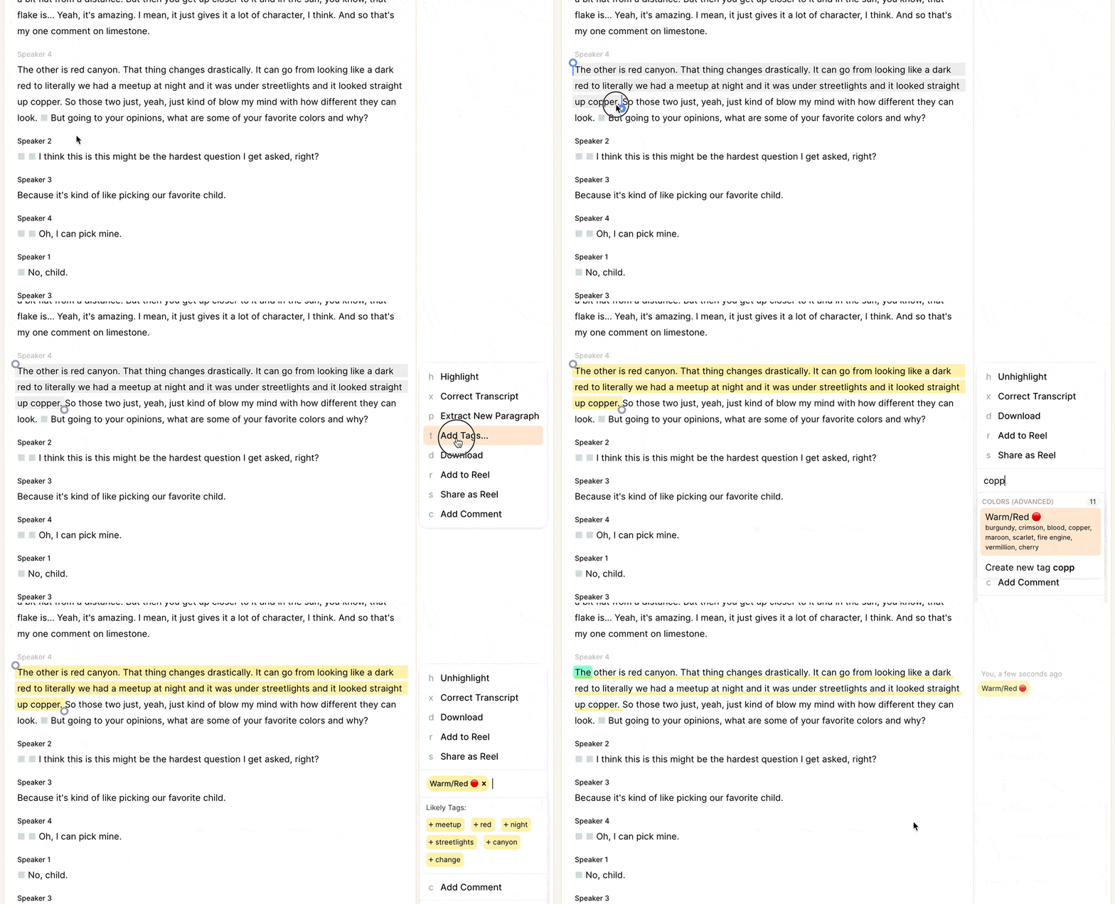
And finally, there’s an additional tag in that group - "_ Color (unsorted)". This can be used as a temporary, intermediate step, such as a first-pass through a just-uploaded recording. Highlights tagged with this temporary tag can then be looked at together in list form by clicking on the tag in the left sidebar, or on the videoboard, and have the more granular tags applied. The temporary tag serves as a sort of to-do list, of highlights that need additional attention or reflection. The tag name starts with an underscore, so that when the codebook is sorted by name, it appears at the top of the list rather than between Cold and Neutral, as it would when sorted alphabetically.
You can view all highlights tagged with this temporary tag in a list view, and work your way down, adding more granular tags, and then removing the temporary tag when you feel good about the other tags you’ve applied.
Once a more specific tag has been added, you can remove the (unsorted) tag from that highlight (it’s now sorted, after all!). If you later want to see all of your highlights tagged with any of the tags in that group, you can click on the tag group name in the sidebar, which will select all tags within it and display a list view of all relevant highlights
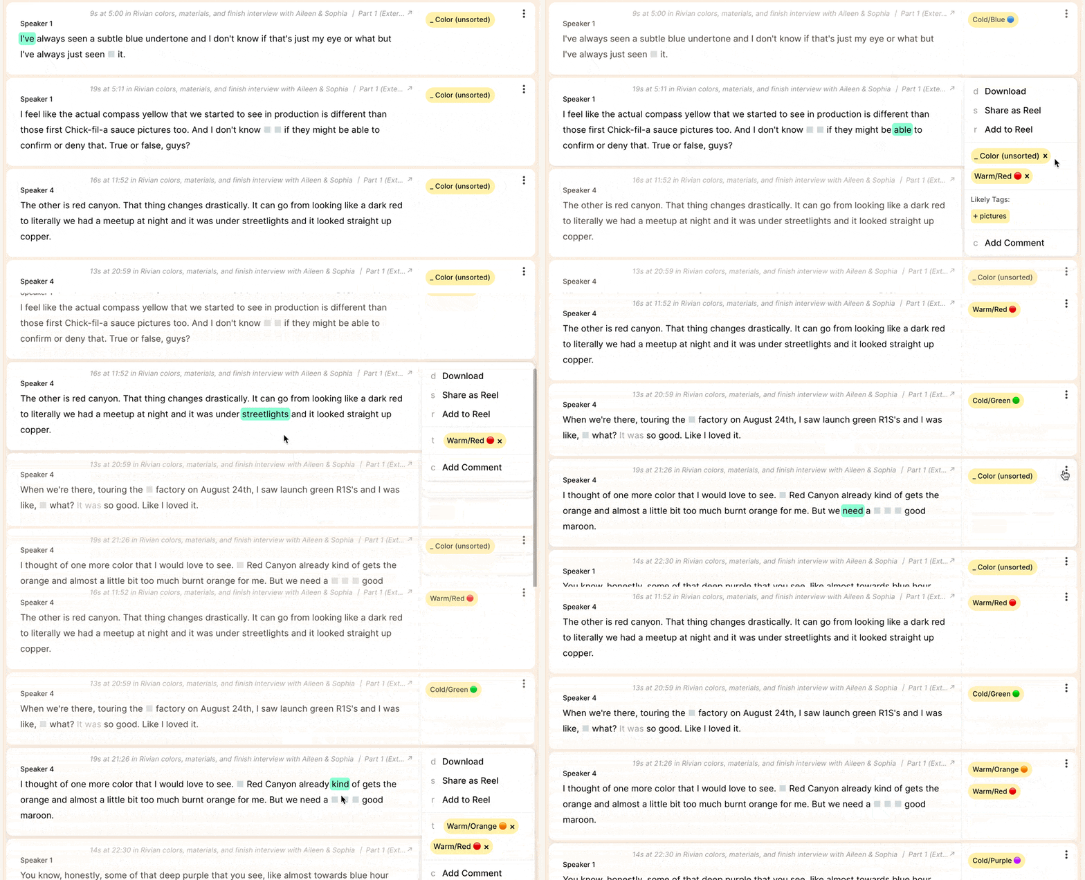
In other cases, you might prefer to bring your highlights onto a videoboard, to analyze them spatially, and synthesize meaning from your material.
You can drag single highlights from the left sidebar onto your videoboard, but for this workflow, you likely want to drag in a whole bunch, in one go. To do this, you adjust the filters on the left sidebar as needed - eg, "all highlights from a specific recording" or “all highlights tagged with ‘_color’”, and then drag the “17 matching highlights” onto your board; you’ll end up with a pile of the 17 highlights in question. You can also drag the “54 Untagged highlights” with a similar result. (These piles can be arbitrarily large, if you have lots of highlights!)
Alternatively, you can drag a tag directly from your left sidebar onto the videoboard; that tag object can then be expanded (keyboard shortcut: e) to leave you with all highlights that have had that tag applied to them.
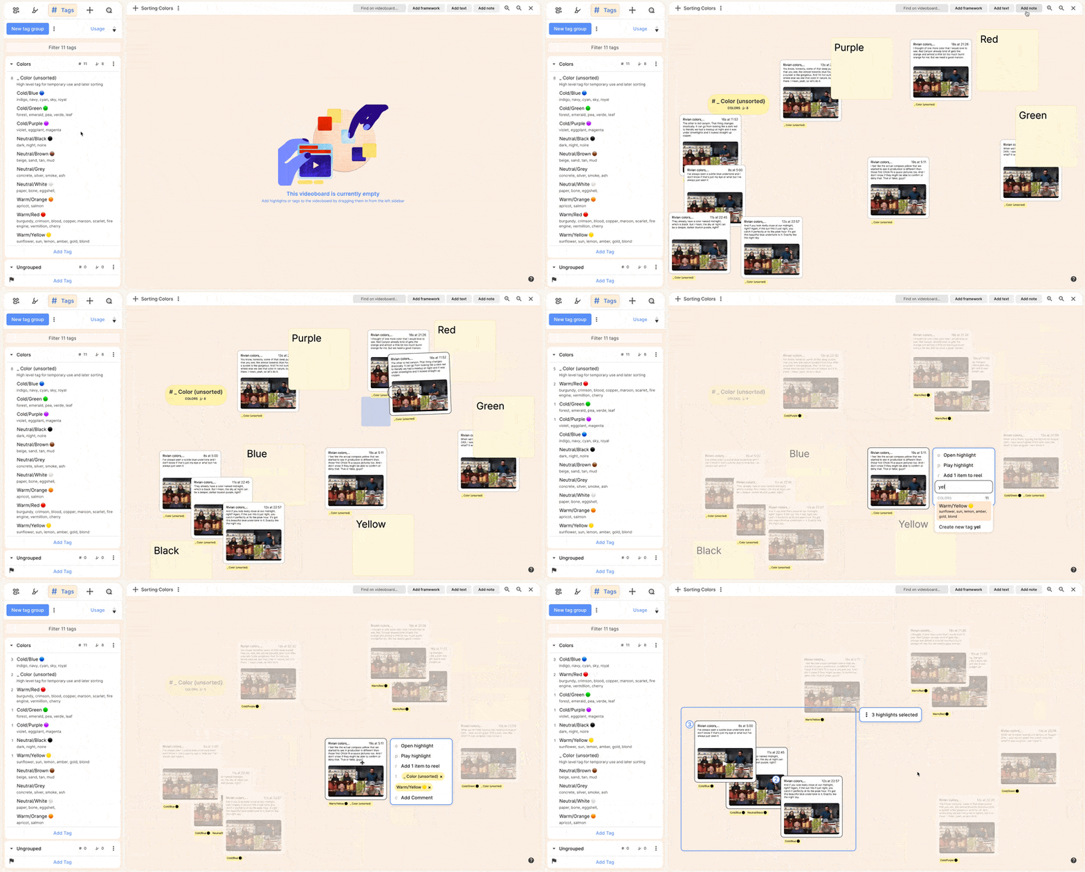
You can double click to play any individual highlight, or make a selection and play them back in sequence. The "Find on videoboard" feature lets you rapidly select highlights on your board that include a specific term or phrase, which you might them choose to move around to leave you with thematic clusters. Use frameworks to help you make sense of what you have, and text or sticky notes to label things or capture thoughts as you go.
With a single highlight or a group of them selected, you can add or remove tags using the same interface you are used to elsewhere in Reduct.
And once you are happy with your clustering, you can create a selection, and add to a reel directly from the videoboard. Note that the order in which you select items becomes the initial sequence in the reel. Once in a reel, you can reorder or fine-tune your narrative.
Conclusion
Taxonomies have long been studied as representations of meaning - there are entire fields of academic study on how people categorize things. In the context of a product like Reduct, how they are set up can also have a dramatic impact on a user’s experience and workflow, in turn influencing the work that is created. This is especially true when working collaboratively - perhaps asynchronously, or with colleagues with different approaches, backgrounds, or levels of experience. It’s a fine line: To plan sufficiently to ensure a smoothly functioning workflow, but to avoid over-engineering things out of proportion with your actual needs. But when you are able to get it right, you’ll find that your team is more efficient, and can spend more of their precious cognitive power on finding and making meaning.
We’d love to hear any additional tricks you’ve developed in your work! Send us a note at hello@reduct.video.
